
Why People Don’t Complete Your Forms (And It’s Not Just the Number of Fields)

Robin Adams
Chimpmaster General

“You expect me to answer ALL these questions?
If you’ve ever looked for advice on improving your online forms, you’ll almost certainly have come across the suggestion that you should ask fewer questions.
And it’s not bad advice. After all, the more information you ask someone to provide, the more effort you’re expecting them to make. If all you really need is an email address, there’s probably no reason to ask for their job title, company turnover and what they had for breakfast.
But I do wonder whether we’ve become a little too obsessed with making forms as short as possible.
Because sometimes, asking for more information is exactly what we should be doing.
Let’s say you’re running a newsletter for people interested in fitness. Knowing whether somebody is a complete beginner or has been training for years could make a real difference to the information you send them. That’s potentially worth asking at the point they sign up, rather than treating it as an unnecessary obstacle.
Of course, whether people are willing to answer is another matter. And that’s really the point. The number of questions is only one part of what influences whether somebody completes a form.
There are quite a few other things worth considering before we start enthusiastically deleting fields.
Not all forms are created equal
Think about the different forms you come across during an ordinary day online.
You might have a simple newsletter sign-up sitting quietly in the footer of a website. Someone reaches the bottom of a page, likes what they’ve read and decides they’d like to hear more. In that situation, asking for an email address might be perfectly sufficient.
Then there’s the pop-up form. You know the sort. You’re halfway through reading something interesting when a box suddenly appears asking whether you’d like to subscribe to a newsletter you didn’t even know existed thirty seconds ago.
That form has a rather different challenge. It’s interrupted somebody, so it had better have a pretty good reason for doing so.
And then there’s an event registration form on a dedicated landing page. Someone has probably arrived there because they’re already interested in attending. They might be perfectly happy to answer several questions, particularly if those questions are relevant to the event or help the organiser provide a better experience.
All three are forms, but they’re appearing in different circumstances, to people with different levels of interest and expectations.
What they have in common is that we’d quite like people to finish filling them in.
So how do we give ourselves the best chance of that happening?
A framework for thinking about forms
We’ve been working on a simple framework at Chimp Answers called OPTINS. The idea is to look at six different aspects of a form, rather than concentrating exclusively on how many fields it contains.
It’s something you can use when you’re creating a new form, but it’s equally useful when you’ve got an existing form that isn’t performing quite as well as you’d hoped.
Here’s how it works.
O — Objective
Before doing anything else, what are you actually trying to achieve with this form?
That might sound rather obvious, but it’s surprisingly easy to get caught up in building something without properly considering what you want it to accomplish.
A newsletter sign-up, a webinar registration and a sales enquiry all have different purposes. Understanding the objective helps determine what information you need, where the form should appear and what should happen when somebody completes it.
It’s also worth thinking about what someone is actually agreeing to. Are they registering for a particular event, signing up for ongoing marketing communications, or being asked to agree to several different things?
Those aren’t necessarily the same thing, and being clear about the objective helps us work out what permissions or other arrangements are needed.
P — Practical
This is where we get into the actual form itself, starting with what type of form we’re using and where it’s going to appear.
Is it a pop-up? A form embedded on a dedicated landing page? Or perhaps a simple newsletter sign-up sitting in the footer of the website? Each has its own practical considerations, and what works brilliantly in one situation might be completely unsuitable in another.
Then there’s the design. How does it actually look? Are the questions clear? Is the font large enough to read without reaching for your glasses? Are the fields laid out sensibly, and is it obvious what somebody needs to put in each one?
And, yes, have we got the right number of questions?
It’s also worth checking what happens on a mobile phone. A form that looks perfectly respectable on your lovely big monitor can become a rather unpleasant experience when somebody tries to complete it with one thumb on a crowded train.
And don’t forget any wording around consent. If you’re asking someone to agree to receive communications, is it clear what they’re agreeing to? Are the choices presented sensibly, or have we hidden everything in a paragraph of small print that nobody’s going to read?
T — Traffic
Who’s actually arriving at the form, and how did they get there?
Someone who’s clicked through from an email specifically inviting them to register for an event is in a very different position from somebody who’s casually browsing your website.
It’s worth considering whether the people seeing your form are the people you actually want to reach, and whether what you’re offering matches the reason they’ve arrived.
There’s not much point having a beautifully designed form if it’s being shown to people who have absolutely no interest in completing it.
I — Interest
This is where we need to put ourselves in the visitor’s shoes.
We know why we want someone to complete the form. We’d like their email address, their registration or perhaps a little more information about them.
But what’s in it for them?
Are they getting something useful? Is there an interesting event, a helpful resource or an offer that genuinely appeals to them? Do they feel there’s a good reason to spend their time answering our questions?
It’s easy to become so focused on collecting information that we forget somebody has to want to give it to us.
And sometimes, making the reason for completing a form more compelling will achieve far more than removing a couple of fields.
N — Next
Right, somebody’s completed the form. Lovely. Now what?
This is something we need to work out when we’re creating the form, rather than leaving it until somebody asks why nothing happened after they pressed Submit.
Should they be redirected to a thank-you page? Will they receive an email? Is there an automation that needs to start? Does somebody in the business need to be notified?
And, rather importantly, where is all that lovely information they’ve just provided actually going?
A successful submission should be the beginning of whatever process we’ve designed, not the point where everything disappears into a mysterious technical black hole.
S — Settings
Finally, we have all the technical bits and pieces that make the form work.
Depending on the platform you’re using, there may be quite a few things to consider. Required fields, validation, integrations, where information is stored and how it’s passed to other systems.
And if you’re collecting consent or communication preferences, are those choices being recorded correctly? If somebody hasn’t agreed to receive marketing, does the system respect that decision?
Then there’s testing.
It’s worth actually completing the form yourself, preferably more than once and on different devices, to make sure everything behaves as expected.
You’d be surprised how often a form looks absolutely fine until somebody tries to use it. Although discovering that nobody’s been receiving your enquiries for the last month is probably one surprise you could happily live without.
Using OPTINS on your own forms
The nice thing about OPTINS is that you can use it in two different ways.
If you’re creating a new form, work through the six elements as you build it. Think about what you’re trying to achieve, who’s going to see it, why they’d want to complete it and how easy you’re making the process. Then make sure you’ve sorted out what happens afterwards and tested everything properly.
If you’ve already got forms on your website, you can use exactly the same approach to review them.
Take a form that isn’t generating as many sign-ups as you’d like. Rather than immediately removing a question, have a look at the other elements.
Perhaps the form itself is perfectly good, but the offer isn’t particularly appealing. Maybe the pop-up appears before somebody’s had a chance to discover whether they’re interested in what you do. Or perhaps the form works beautifully on a desktop but is a nightmare on a phone.
You can even give yourself a simple score out of six, based on whether you’re happy with each element.
Of course, getting six out of six doesn’t mean your form is suddenly going to become a sign-up generating machine. There are still plenty of things outside your control, and what works for one audience won’t necessarily work for another.
But if you’ve considered all six elements, you’ve at least given your form a fighting chance.
And if you’re only scoring three or four, you’ve probably got a few useful places to start looking before you start making changes.
Getting people to complete forms is only half the story
There’s another side to all of this, which brings us back to where we started.
What information should we actually be asking people for?
Sometimes, getting an email address is absolutely enough. We can learn more about someone later, once we’ve established a relationship.
But in other situations, an additional question or two could give us information that makes a genuine difference to how we communicate with them. The challenge is deciding what’s worth asking now, what can wait and what we don’t really need to know at all.
And that’s why we shouldn’t become obsessed with simply making forms shorter.
The aim is to create forms that people are happy to complete, while collecting information that helps us do something useful afterwards.
So next time you’re creating a form, or wondering why an existing one isn’t performing particularly well, give it the OPTINS treatment. Look at all six elements, see where there might be room for improvement and make sure you’ve actually tested the thing.
You might discover that removing a couple of questions is exactly what’s needed.
Or you might discover that the questions were never the problem in the first place.

What Happens Next? Finding the Gaps in a Mature Email Marketing System
Even a mature email marketing system can have gaps. Over Fifty Fitness discovered what happens when you follow the customer journey beyond the final automated email.

Your Forms Shouldn’t Be Designed Around Mailchimp
Just because Mailchimp lets you collect information doesn’t mean you should. Here’s why your forms should start with what you actually need to know about your contacts, rather than what your email platform makes easy.

How Much Do You Trust Your Marketing Systems?
We rely on data, automations and reports to make marketing decisions. But what happens when you stop trusting them? Here’s why confidence in your marketing systems matters more than you might think.
How We Helped Mornington Screening Service Trust Their Email Marketing
Trust your marketing automation with confidence. Discover how Mornington fixed incomplete customer journeys and created a dependable Mailchimp system.

How City of Charles Sturt updated their communication system
Discover how the City of Charles Sturt consolidated two Mailchimp accounts, improved subscriber data and built a smarter, more relevant email communications platform.
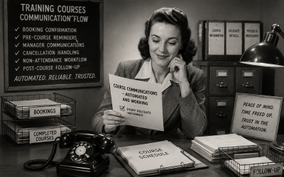
How We Helped an MOT Training Provider Stop Worrying About Course Communications
The MOT Training & Compliance Group relied on manual emails to keep delegates informed before and after their courses. We helped them build a Mailchimp automation system that handles confirmations, reminders, cancellations and follow-ups automatically, giving the team more time and confidence that no one gets forgotten.
0 Comments